Cover art is a tricky business. It can make or break a book. And it's always dangerous for authors to have too much say in their covers. But, as with other Sordelet Ink books, I get final say.
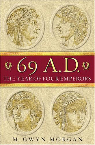
It was bad from the start. I walked into this art design thinking I knew what I wanted, and at the same time not liking the idea. Because I am often quite literal-minded, I was thinking of representing each of the five emperors in this novel – floating coins of each usurper, centered around Nero's coin/bust/face. Then I realized I was unconsiously stealing from one of my sourcebooks, Gwyn Morgan's excellent 69 A.D. – THE YEAR OF THE FOUR EMPERORS.

So I discarded that, but was still hung up on coins. I thought about coins spilled from a vase, with each of the emperor's faces upwards from a bloody ground, and even found some art that I almost liked.
But still, I was being far too literal minded. Besides, these are going to be Amazon thumbnails for the most part. To havesomething as subtle as coin faces on a bloody ground would mean very little to the average Amazon Kindle shopper.
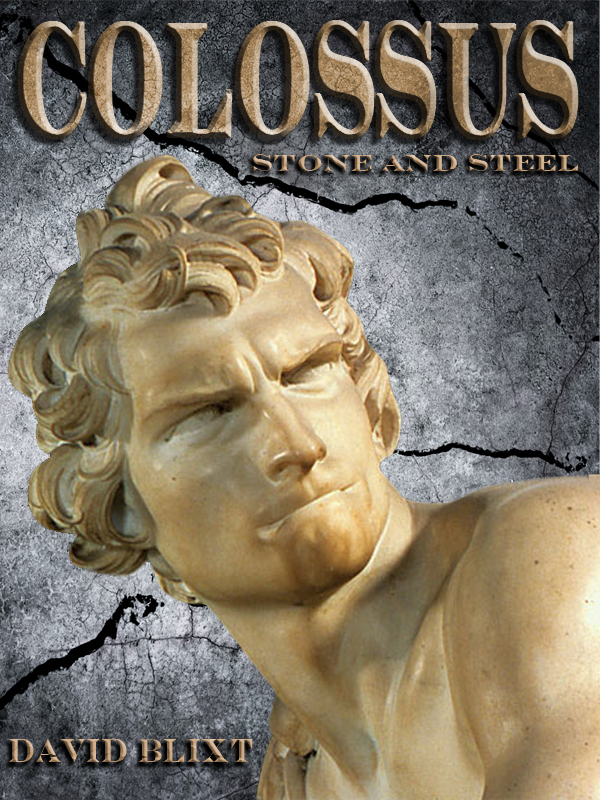
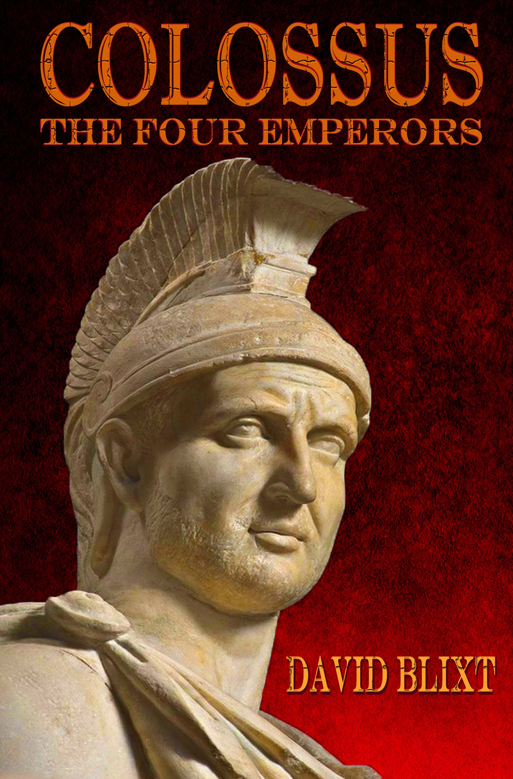
So I returned to the image for the first Colossus novel, designed by Rob McLean, and decided I much preferred something along those lines. I looked at all the faces of the emperors in question, and decided against them all. Instead I chose a Rome legionary to be my stand-in for Sabinus, just as we used Bernini's David to stand in for Judah (and Asher, his twin).
So allow me to present the cover for my upcoming Roman novel, COLOSSUS: THE FOUR EMPERORS.


wonderful choice! Appealing to (us) plebes and great visual continuity with “Colossus”. My daughter is an artist/designer and I am continually amazed at the ability of the “visual creatives” to capture the essence of the vision of the “verbal creatives”.